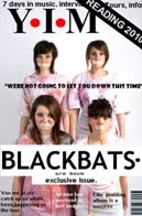
Front Cover.
Jade Bowstead- "this reminds me of the magazine NME? if i looked at this magazine when in a shop i would automatically know it was for the indie genre of music. The reading 2010 strip in the corner made this clear because the reading festival is full of bands for the indie/rock genre"
Rachael Tiller - "this looks pretty professional Rosie, I'll buy it when it comes out ;) i simple but effective"

Contents Page
Jade Bowstead - "i like how you've named all the bands i can read about so i don't have to look around for them"
Amy Mairs - "the special offer you have used at the bottom makes the contents look much more real and like a real magazine however the colour scheme you have used (black) doesn't go with the rest of your magazine so it looks like it belongs to something else" <--- because of this i changed my contents page to the colour greyRachael Tiller - "the snapshot you have used on the right hand side i liked as it gives you an in site on celebrity gossip and everybody loves a bit of gossip!"

Double Page Spread
Jade Bowstead - "i like the pictures you have added to the double page spread, it makes the page over all look incredibly appealing"
Amy Mairs - "the logo and BB in the background i especially like because its quite unique and isnt normally found in other magazines however, it works"
Rachael Tiller - "the actuall story is readable and i feel people would want to know about this sort of things about the band becuase it includes tour details etc"
No comments:
Post a Comment