Tuesday 4 May 2010

Name - Rosie Redman. John F Kennedy School.

Candidate Number - 6226 Centre Number - 17131

Thursday 29 April 2010


I asked a few of my piers to give me feedback on my product as after all they will be the one buying my magazine.

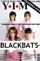
Front Cover.

Jade Bowstead
- "this reminds me of the magazine NME? if i looked at this magazine when in a shop i would automatically know it was for the indie genre of music. The reading 2010 strip in the corner made this clear because the reading festival is full of bands for the indie/rock genre"

Amy Mairs- "i really like your background image for your front cover because it is quite unique and wont be found on other magazines around if it was being sold in a shop meaning it will be eye catching to the genre fans"


Rachael Tiller - "this looks pretty professional Rosie, I'll buy it when it comes out ;) i simple but effective"


Contents Page


Jade Bowstead - "i like how you've named all the bands i can read about so i don't have to look around for them"

Amy Mairs - "the special offer you have used at the bottom makes the contents look much more real and like a real magazine however the colour scheme you have used (black) doesn't go with the rest of your magazine so it looks like it belongs to something else" <--- because of this i changed my contents page to the colour grey


Rachael Tiller - "the snapshot you have used on the right hand side i liked as it gives you an in site on celebrity gossip and everybody loves a bit of gossip!"


Double Page Spread

Jade Bowstead - "i like the pictures you have added to the double page spread, it makes the page over all look incredibly appealing"

Amy Mairs - "the logo and BB in the background i especially like because its quite unique and isnt normally found in other magazines however, it works"

Rachael Tiller - "the actuall story is readable and i feel people would want to know about this sort of things about the band becuase it includes tour details etc"


Wednesday 28 April 2010

How does your media product represent particular social groups?


How is it attracting your target audience?

It attracted my target audience because I stuck to the music gene from my designs, I used colours associating with the music genre and when taking photographs of my models I made sure they looked interested in my genre indie/rock. When creating my front cover for my magazine, I had to consider what would really attract and address my target audience. When it came to me background image I edited it via Picasa on my laptop and I made all the stories stand out by broadcasting them in a bold font. The font i chose for my mast head is simple but I feel quite affective. I chose a bold font yet again for my title Y.I.M, I put the font into capitals so that yet again my magazine is more appealing to others. On my front cover I showed what would be seen in my magazine. It has all the relevant information needed and it emphasized the main parts on the magazine to entice the person to purchase it. From my contents page and double page spread you can see that I added greater detail about the pages like real magazine would have done. The photograph on my contents page is of a different person from the front cover which shows that the magazine has a various amount of different stories. Again for my double page spread and contents I stuck to the colour scheme to the front cover so it was eye catching throughout. The colours I used I felt were good as it relates to the genre indie and rock. The Contents page clearly states everything you are going to expect to read in the magazine and it is all about the genre of music the reader would be interested in. For my double page spread I made a interview with the band I created called BlackBats, the page layout was set out like a magazine (in sections) and it was easily readable. I put the BB in the background of my paragraphs to emphasize that the double page spread was about my band, I also added more pictures form my bands photo shoot so the reader felt like they are getting to know the new indie band. Because of these points and again keeping to a unique font in my title it was attractive to the reader.

Tuesday 27 April 2010

In what ways does your product use, develop or challenge forms and conventions of real media products?


What kind of media institution might distribute your media product and why?


Who would be the audience of your media product?

More information about my target audience (not on the picture) is that they would be the kind of people interested to attend gigs. The genre like to dress individually, and have a unique style. The cloth's shops they would like to shop in would therefore be unique in selling clothes that fit in with the genre of music they are interested in. There hair style would also express the fact they enjoy this type of music. They would have long, messy hair showing that they dont really care what people think. My collage is an example of the type of person who would be interested in this genre/my magazine.