Wednesday 24 March 2010

My photoshoot and images i considered.


My photo shoot was a success and i had many images to choose from to use on my contents, front page and also my double page spread. overall i didn't use any single images because my whole magazine i decided to base on the band i named BlackBats. When looking at the single images i took above i felt that this would have worked if i was to focusing on a solo artist in particular because they fit into my type of genre, however because i was writing about a band i thought i should put pictures of the band in it not some of a few members.
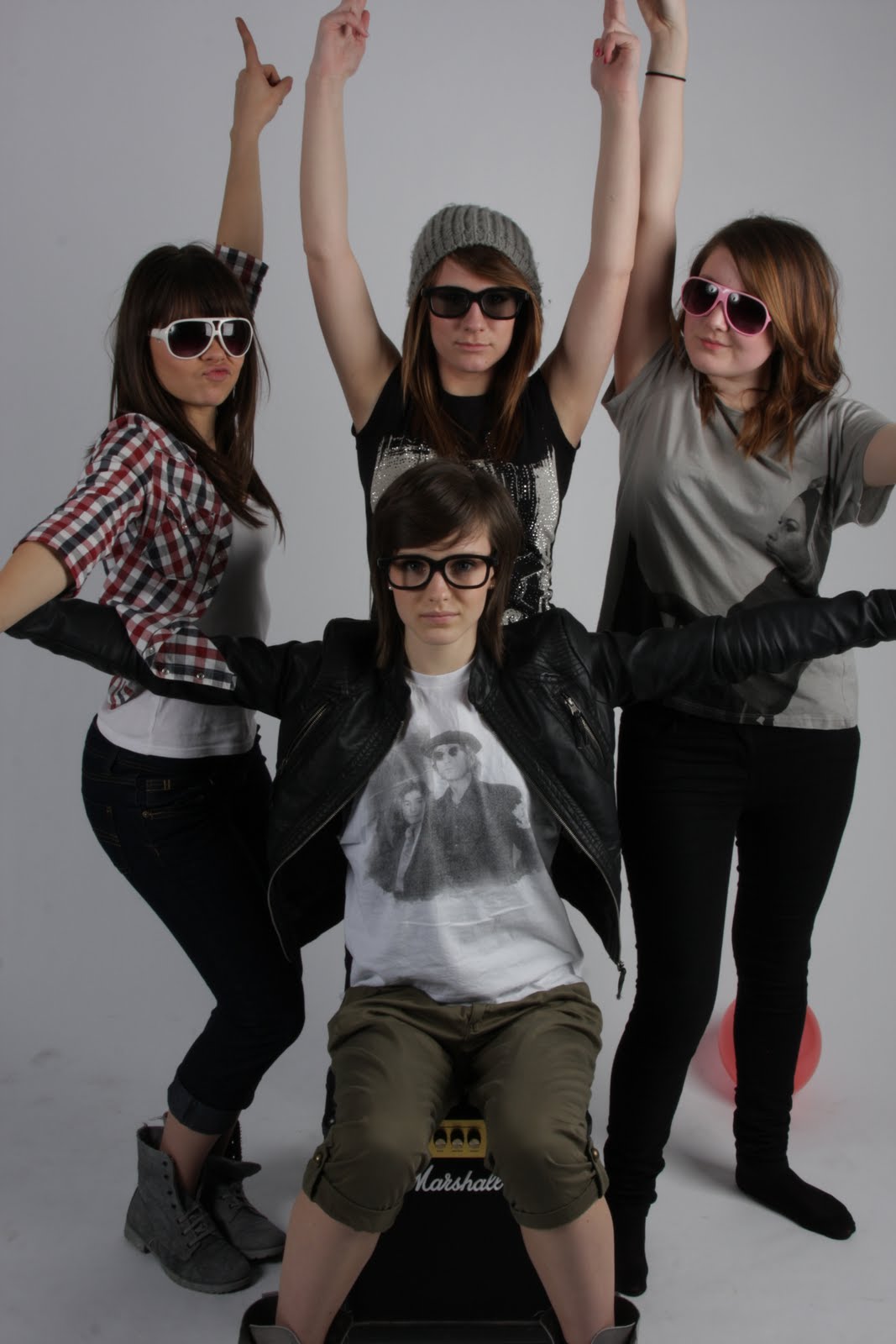
After this decision had been made i then had to choose between the group images. My girls had three outfit changes so there was a lot of images to choose from. The first image i have posted consisted of all the girls wearing glasses, i didn't not choose this image because i think that no eye contact is appealing to the audience. The second and third image i didn't choose to use because the lighting unfortunately was too dark and when i tried to edit it the effect of the picture wasn't as good as i hoped for. My final group image i posted i also liked however i felt like the four girls were separated into two and i wanted them to look like they were close friends, meaning them being closer together.


Tuesday 9 March 2010

logo ideas

i have decided to call my magazine Y.I.M meaning you indie magazine i got this idea from the magazine NME as it is catchy and easy to remember however when it comes to the logo it self i do not want it to be a copy write of the NME logo so i am trying to make it much more different. I looked at three different colours and three different fonts to use on my logo and even though i like the black and red one the most i am not going to use it because it looks too much like the NME logo, however i am planning on using the font because it stand out in front of other magazines.

Wednesday 3 March 2010

my photoshoot ideas


This is my basic plan for my photoshoot when it comes to my magazine. I am taking different kind of pictures as i will be using them on both the contents and the front cover page. (click on the image to make it larger)

.


This is an image that represents what audience my magazine is going to focus on, my theme is the genre indie so i will be putting information about indie bands and festivals such as underage and reading. I have chosen to do this becuase it is music that i listen to meaning that i will know a alot about it.

Tuesday 2 March 2010


When i researched my front covers i found out what i defintately did NOT want to do when it came to my own front cover. I looked at smash hits first and noticed there was alot of pink clearly showing that the magazine was for girls, i do not want this to happen when it comes to my magazine becuase it is not based for a certain gender it is based on the music genre indie. Looking at the magazine cover of NME inspired what i want to do with my own magazine becuase it is based on the type of genre im working with. The group image with the main perfromer i thought was a good idea becuase even if i didnt know the band i would know that she did an important part. The bold and different coloured writing on the main story headline was also good as it appealed more and i knew automically who it was going to be about. The logo stood out on both magazines, this is quite important as if they didnt stand out the audience would find it hard to recognise them. To make the logo stand out i have decided to put a bold and unique font type and colour.